Mercado Pago Payment Agenda
What is
Mercado Pago?
It's the digital wallet by Mercado Livre, the biggest tech company in Latin America. With it, the user can do a big range of financial transactions like payments with QR code, pay bills, buy credits on the phone, etc.
With more than 8 million active users, Mercado Pago is in many countries of Latin America among those Brasil, México, and Argentina.
To comply with my non-disclosure agreement, I’ve omitted confidential information in this case study. The information that follows is my own and does not necessarily reflect the views of Mercado Livre.
The challenge
Design a new feature inside the app that allows the user to receive its bills and pay directly through that app, without the need to have the bill in hand. With that, also design a notification feature that allows a bigger financial control for the user.

First designer in the
Brazilian UX team
In the period I was working on this project, I was the first and only UX designer on brazil's team. A challenge that allowed me to learn a lot about cross-cultural communication processes with the Argentines.
Main tasks
→ Desk Research
→ Benchmarks
→ Map the user journey and use cases
→ Usability testing
→ Design critique sessions
→ Wireframes
→ User Interface
→ Document the process
The Design process

Discovery
Benchmarks
It was important to understand how the big banks were doing its user experiences flow, but also to know where the opportunities for improvements were. So the benchmarks followed two paths:

Understanding the Brazilian people profile
Consulting internal data, we found some insights from specific user samples. But for the project was also important to understand the habits and the main user pains with a more holistic point of view.
The research focus was to look for financial reports from Brazil and the world. It was important to understand the user pains points on paying bills. Some findings from the research were:

Some information was omitted or altered on purpose due to its confidentiality.
Definition
Objectives
After analysing the gattered information and some internal conversations, we came to paths more or less like these:

The hook model
The hook model proposed by Nir Eyal in his book Hooked is used to encourage the recurrent usage of a product, delivering value to the user and at the same time generating habit.
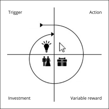
Starting from an easy flow that generates rewards for the user and successively bringing ways to engage, it was the way we found to generate more recurrence of use.
Understanding the actual flow impact
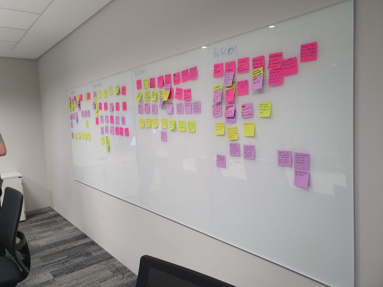
It was possible that new steps would appear in the pre-existing flow. So it was important to share those possible changes and impacts with all the stakeholders.

Consider the limitations
We were using a banking infrastructure that had some limitations, so it was good to have open communication with all the team through the process. It was an essential step for aligning everyone's expectations.
Ideation
Flow mapping
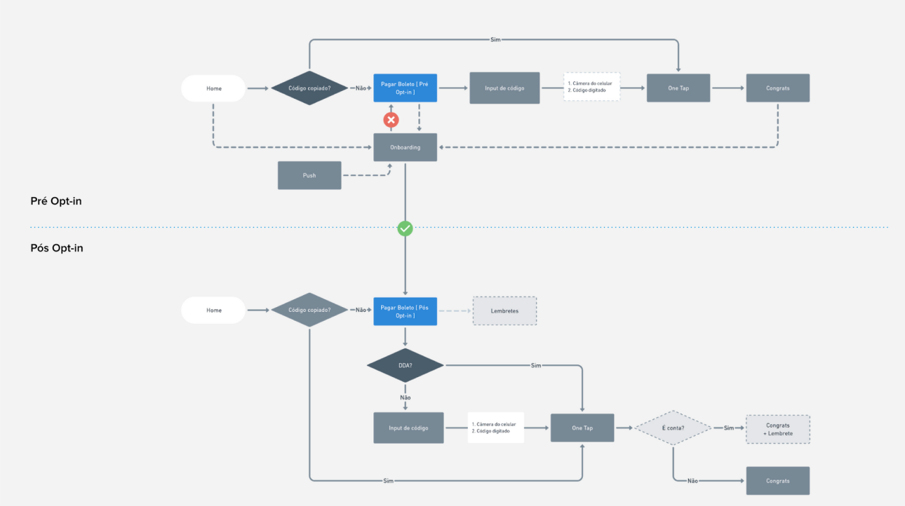
With the mapped impacts, we reached the phase to design the possible paths on the flow and an ideal solution. So we divided the flow into two parts because we knew that an opt-in step was mandatory for the system:
Sketch & wireframes
Our information architecture was based on the actual mental models of bill payment, organized on priority levels:
1. Scan the barcode
2. Copy & paste the bar code
3. Paying the received bill
4. Typing the barcode
With that, we already knew which were the paths that we would give more focus to the user in the experience. That's when we brought the team to discuss our solutions.

Assumptions validation & testing
This step consisted of two parts. The first one with stakeholders, to discuss the pros and cons of each idea and understand the businesse point of view.
The other one with the user, with quick coffee shop user testing to understand its point of view and if the solution was usable.

Delivery
Pre-existing payment models
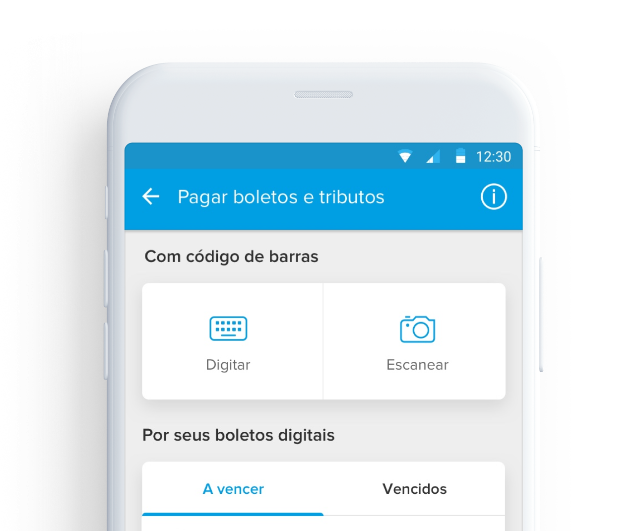
Scan & typing flow
Both the input barcode methods were designed to be the first thing that the user would see in the screen. We knew that the users would still pay a lot of its bills by this method.

Copy & paste
If the user had a barcode number copied, the app would suggest if the user want to pay it. Regardless of the screen he is on.
Anticipatory design
I like to work with the concept that the system should anticipate the user's needs generating powerful emotional rewards, creating a stronger connection with the product.

The payments agenda
The new feature, that would appear after activation. With it, the user could:
• See their next bills to pay
• Pay without the physical bill
• Be reminded when a new bill arrives
• Be reminded when is the due date
Tabs
We knew about the habits of overdue payments in the Brazilian reality and also about some limitations of functionality. So we separated it into two tabs for a better experience.
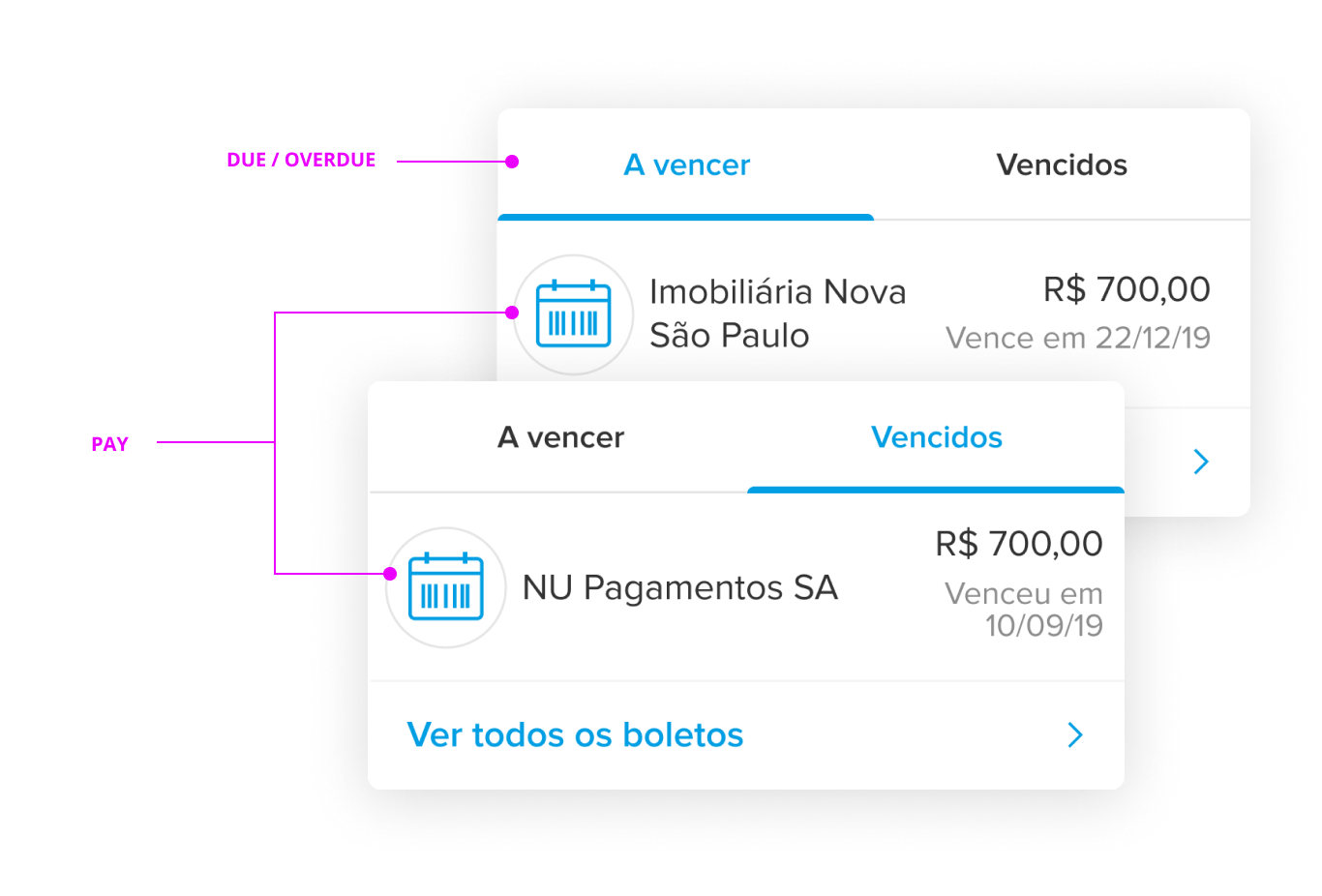
Expanded listing
A more detailed listing hierarchy divided by a monthly timeline.

Smart push notifications
This is one of my favorite parts because of its simplicity. The most important step would be the experience outside the app, so we had to understand the usage patterns through data and create a solution to stimulate an already established behavioral pattern.

Some information was omitted or altered on purpose due to its confidentiality.
Simplified payment
By the end we delivered a simplified bill payment solution. Reaching the objectives that we had initially proposed and with an extensive backlog of solutions that we could work with in the future.

Results
In the first two months after implementation, we could get many good results that expected the company goals.
Increase of around 10% of active users
Increase of around 10% in payments made
The company's goals were exceeded by 30%