Itaú Abreconta
What is App Abreconta and Itaú?
Abreconta (account-opening in Portuguese) is the gateway to Itaú's digital clients. With it, the user can create and set up basic configurations of his new bank account, send documents, and after some days has his account open to using.
Itaú is the largest private bank in Brazil, Ranked by Forbes as one of the largest companies in the world based on business generated, assets, and market value with more than 50 million customers and 10 million digital users.
To comply with my non-disclosure agreement, I’ve omitted confidential information in this case study. The information that follows is my own and does not necessarily reflect the views of Itaú Unibanco.
Highlights
1 million accounts opened in-app
100% redesign to be first implemented in the company
Highest rated banking app in Brazil
Challenges
Full redesign of the app. Improving user experience, navigation, and language.
Increase conversion rates with user experience improvements.
Track metrics and thereby increase flow efficiency.
Comply with internal and Central Bank regulations.
Optimize experience by taking into account systemic limitations and legacy systems.
But the main challenge was on keeping a friendly user experience.
;-)
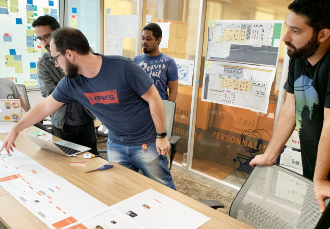
My role
For a year I made several in-app experience enhancements, including a complete redesign of the app. Working together with other squad members and aligned with company goals.
Main tasks
→ Conducting and following closely tests with users.
→ Desk research and company materials related research.
→ Interviews with users and stakeholders.
→ User interface and experience reviews.
→ Motion and micro-interactions.
→ Illustrations.
→ Specifications and Documentation.
→ Partnering work with developers.
The Design process

01
Discover
Stakeholder interviews, user surveys, desk research, and workshops. To understand the problem and define the next steps.
02
Define
From discussions and reviews of the concept, this step often led to some paths such as benchmarks, internal surveys, or user testing.

03
Develop
Conducted concept and usability tests to understand what were the main pains in the flow. Then took more specific prototype tests using the lessons from the previous steps. All to understand all perceptions of experience.
04
Deliver
Documenting the process and collaborating with team members, this was the phase of looking at the entire flow and thinking through all the possible use and error cases. At that time, several refinements were made to deliver.

∞
Follow the process
Continually revisiting the steps to propose further improvements in flow and experience in a constant iterative process.
The Re-desi-gn
The Redesign could almost be a chapter apart from the whole process, but to keep things brief, I'll just explain in a few words and a lot of images.
Our overall goal was to elevate the experience by making it more user-friendly as a whole.
We did a full review of the app that included: visual proposal, interactions, product presentation, shortening flow steps and also moving to a more user friendly language. Taking into account some pre-established standards and possible systemic limitations.

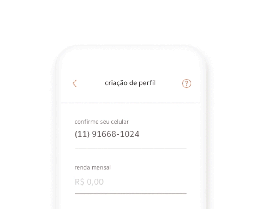
The old app
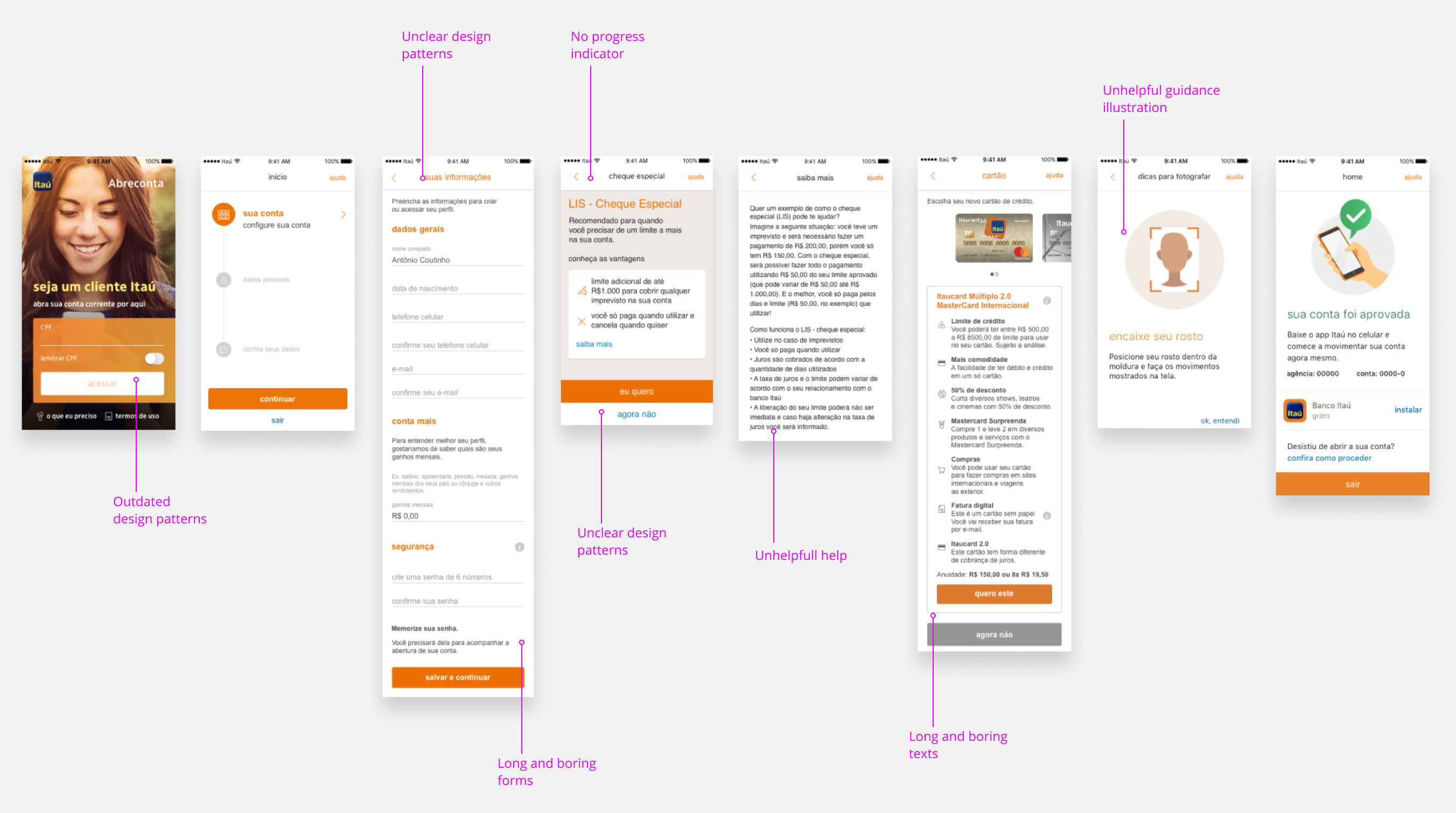
The redesigned app

Results
After the new app was released, we spent some time tracking conversion rates and quickly saw that the redesign was a big success. We got the following achievements with this project:
Increased conversion by 7%
Increased app grade in stores by 0.2
Increased application relevance within the company
★ 4.8 at Google Play
★ 4.7 at Apple Store
