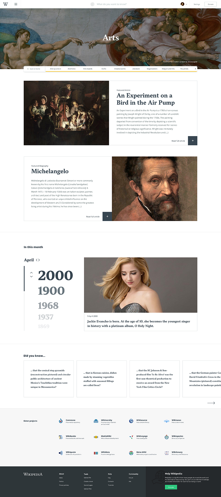
Wikipedia Redesign Concept
Goals
Make it simple, comfortable to use, and adaptable to other devices.
Explore the UX Research process, and the impact in the final design.
Study and experiment with UI Design.
Create an enjoyable experience.
The Design process
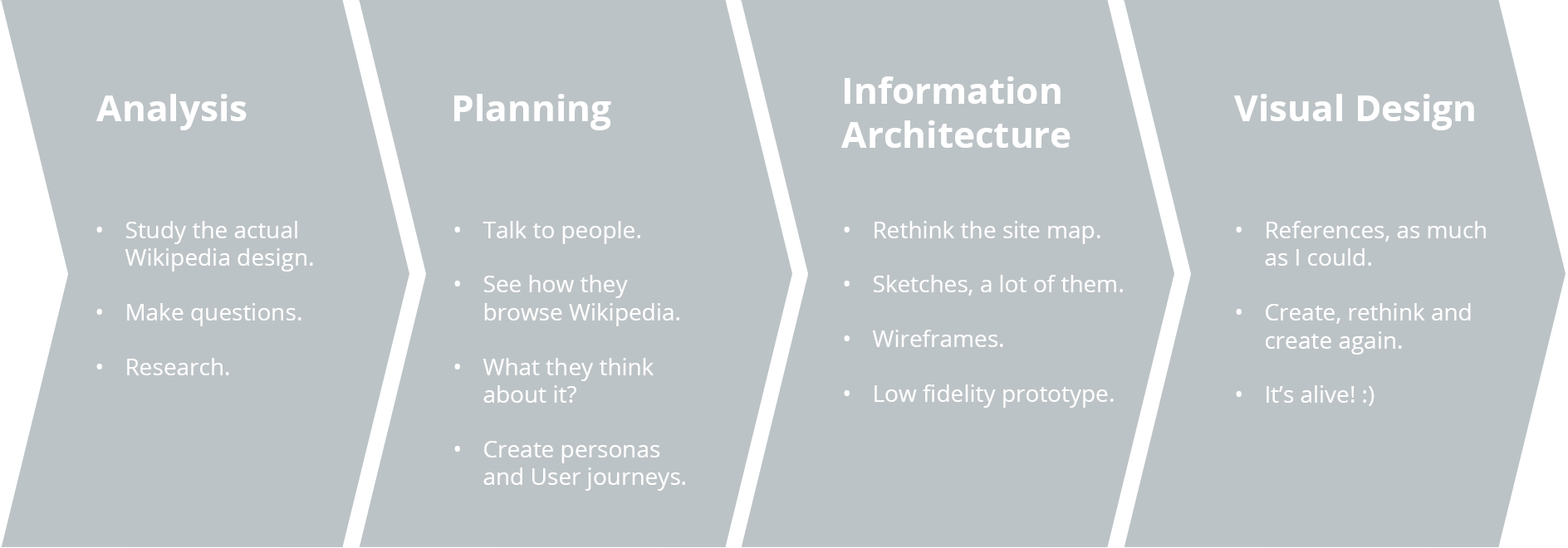
My goal here was to recreate the experience of the main pages from Wikipedia.
So I've focused on Home, Portal Home and Article pages with its main interactions.
01
Analysis
I first started looking at what we have today, what could be improved? What is already good? The visual itself could all be improved, but what else? Is there anything on the experience that could be better? So I started pointing out some things that I think could be improved.

01
Personas & Journeys
I've talked to people and asked what they think about Wikipedia. I ended up creating 4 personas that I believe are the main type of users and also mapped their journey using the tool.
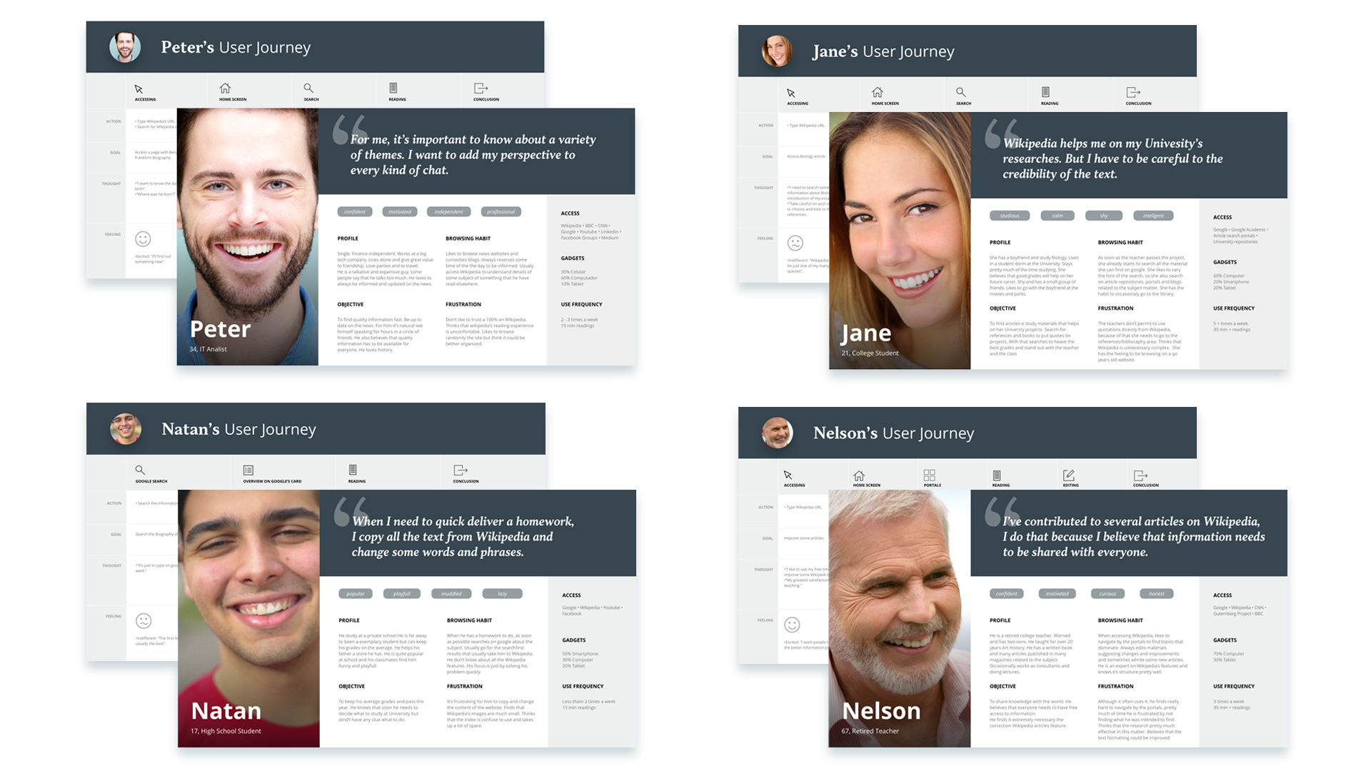

After the analysis and planning, I've discovered that people don't trust Wikipedia at all. So I felt that Its experience should be improved to make it feel more trustworthy.
The experience that I wanted to create should be simple and visually appealing, yet trustworthy. With this in mind, I've set a phrase to act as a Design Principle to guide my thought and synthesize the idea.
So I believe that my Wikipedia should've been some sort of a mix of two guys:

03
Information Architecture
First I've designed the site map and them the wireframes. Always with the term "simplification" in mind. This part of the process helped me to think more hierarchically.
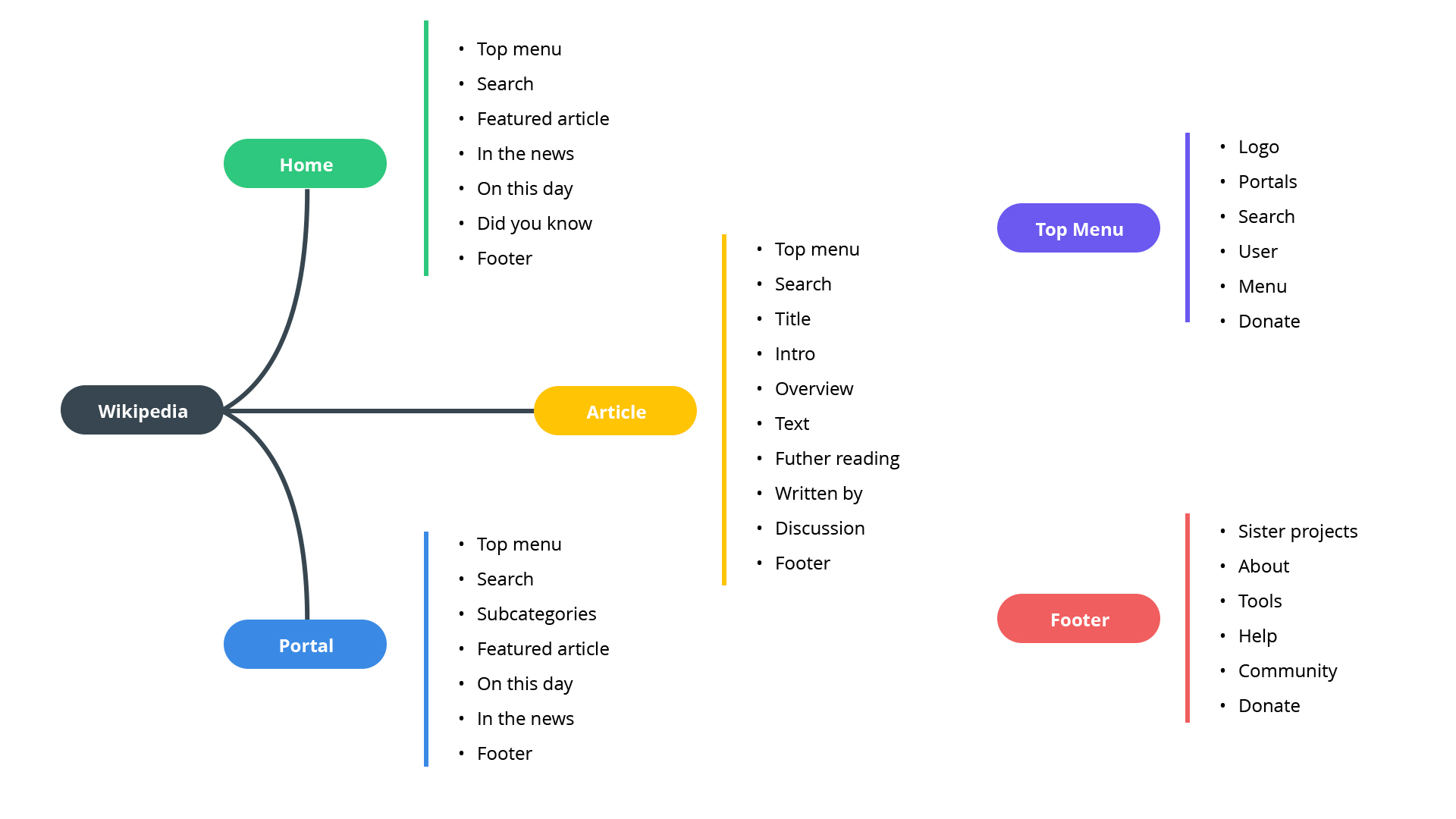
Wireframes
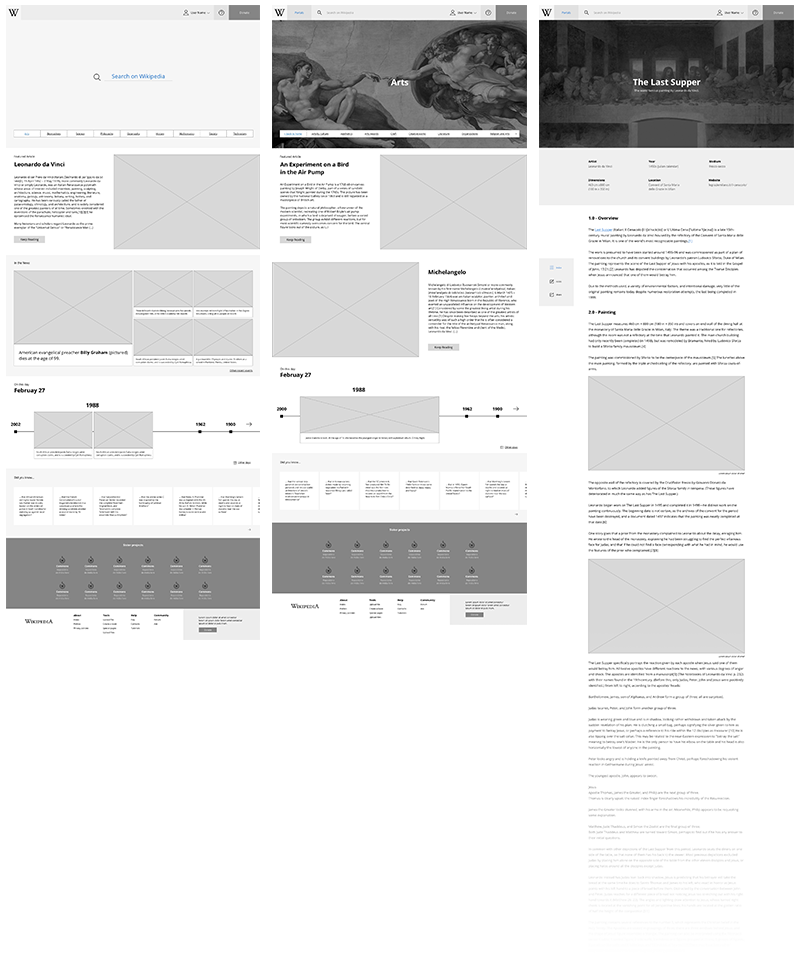
Visual Design

Home
Portal Home
