Telefonica Vivo World Cup Hotsite

Challenge
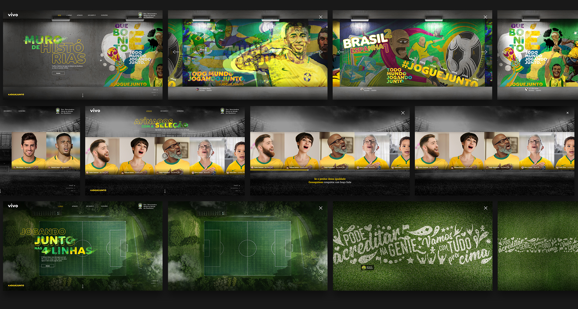
Design an attractive and interactive presentation to the Vivo World Cup sponsorship campaign in a Hotsite. Also with further campaigns in mind how that would integrate.
At that time I had just a sketch of what would be vehiculated as a campaign, so I had to work with the tools that I had.
The idea & the anthem
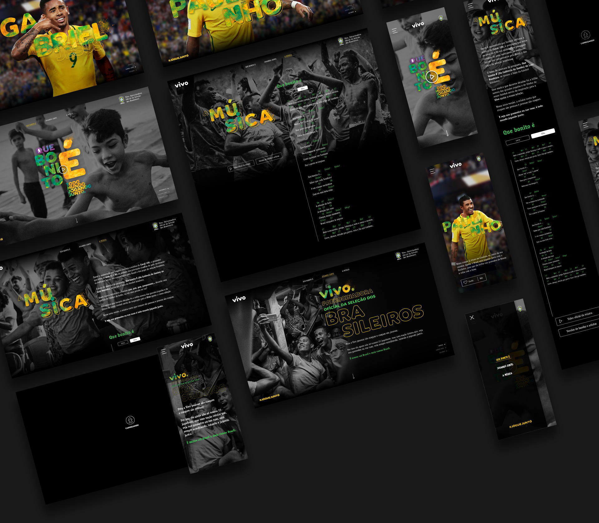
The first campaign was supposed to be an anthem, and what I had at that time was the work in progress cut with a not final recorded song. But I had to create a navigation prototype and an idea to present the anthem lyrics on the site.
Together with the motion team, we first came up with this:
We thought about an interactive video that when you pass the mouse you'd see the lyrics in a visually appealing way. With simple navigation between pages of the site
The good thing was that the client loved it! The bad was that we had just a few days to put this concept to light.
Predicting the future & testing
I had to think about the next campaigns and how they'd be presented on the site. But I just had again some concepts of what would come. So again, working with the tools in hand I created some studies and patterns for how the content could be organized.

Close to the launch of the site I just had around 2 days to organize and test the functionalities to the final layout be implemented, I had big help from other guys of the UX team to make a good and understandable experience.
The final parts I've worked side by side with the development team for fast solutions with their also short time and implementation difficulties. We had a deadline and we needed to let some of our ideas go.
The final design

Home


About
page
The
soccer
players


The anthem
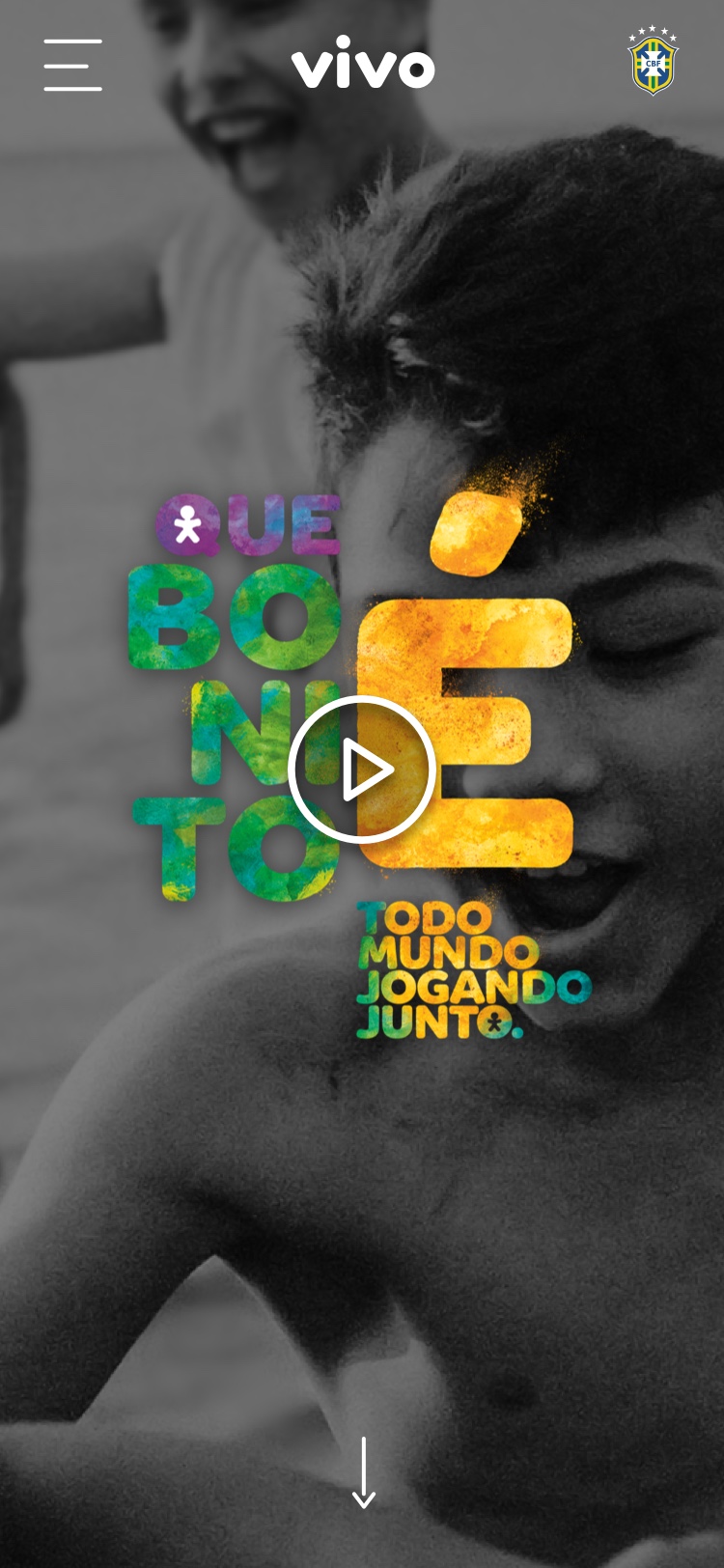
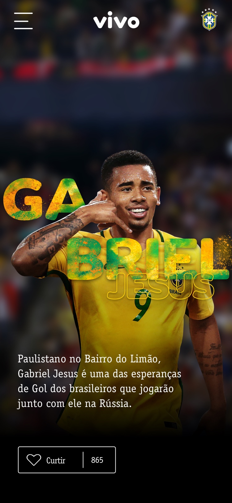
Mobile


