Webmotors Driving Undistracted

The Challenge
& Idea
1.3 million is the number of accidents related to smartphone use while driving. So Webmotors wanted to use their portal to do something and give an alert to people about this big issue on traffic.
First, the user would see a crashed car selling ad on their search on Webmotors. After they would be redirected to a page showing info about this issue and in the end he would be invited to download an app that would help him to not use the smartphone while driving.
Logo studies
& the mascot
First, we needed to give the communication a soft art direction and thinking about the app at the end of the journey we needed to make everything to converge and be part of the same design.

Everyone (including guys the client) loved the logo with the character so we decided to go with it and make some improvements. That's when the 3D artists showed up to do their magic.

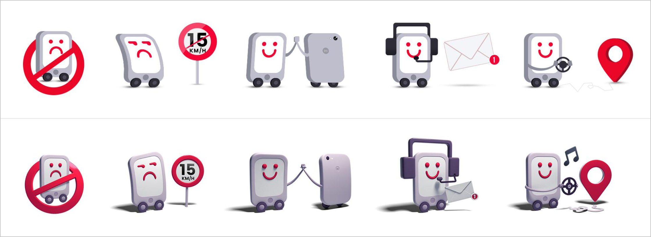
The logo went up the way we wanted to be: soft and friendly. With the mascot that would be the helping friend on our app.

The Car Ads & the Landing Page
For each car ad that was shown on the site, we had a story behind that car accident. So when the user clicked on it, it took him to the landing page related to the story of the car. We had a total of 10 heart touching stories.

After clicking on the banner, the user was taken to the Landing Page:
While creating the landing page I thought that it was interesting to have a simple concept on its navigation, so I thought that while scrolling you could see the car parts as a trail of an accident.

Responsive Design

The app
We created an app that identifies when the car is moving so it silenced all the notifications on the smartphone and showed messages to the user when he tried to access it while driving.
